Affichage des articles dont le libellé est NIRP ZIRP. Afficher tous les articles

2016/03/07

Tout va très bien Madame la Marquise

Dans la continuité de nos analyses publiées dans le GEAB numéros 100 (12/2015) et 101 (01/2016), voici un nouvel instantané de l'évolution de quelques indicateurs que nous avions mis en lumière. On consultera les numéros du GEAB pour de plus amples explications.

Total of China Foreign Exchange Reserves
source: tradingeconomics.com

Comparez 2015-2016 avec 2008-2009.
Saudi Arabia Central Bank balance sheet in SAR million; 
source: tradingeconomics.com

Négatif pour la première fois!
10Y JGB; source: Bloomberg

Y a t'il vraiment un pilote dans l'avion japonais?
30Y JGB; source: Bloomberg

EFSF 10Y; source: tradingeconomics.com

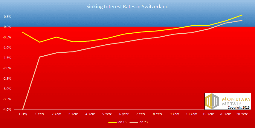
10Y suisse; source: Bloomberg

Et pendant ce temps: retour à la normale de l'économie Russe.
source: tradingeconomics.com


2015/01/27

Evidences for a market crash's forensic analysis


  • Aug. 2013, Dec. 2014, Apr. 2015, June 2015, August 2015 gold futures contracts: backwardations


  • TIC flows : UST

  • China foreign exchange reserves :

  • UST held in custody in NY for Foreign Official and International Accounts :
  • UST rates :
yield curve 3/24/2015

Swiss bond rates structure 01/2015 (source)


10Y Swiss bond rate


We observe same negative yield curves for Austria, Belgium, Finland, Sweden.
  • JGB rates :
5Y JGB

10Y JGB

30Y JGB 
  • 10Y bonds worldwide ranking 02/07/2015 :
  • Exchange rates :
USD / Euro, updated daily

USD / Euro since 1978 ; updated monthly

1Y history,  Ukrainian hryvnia / EUR

5Y history, UAH/RUB
  • Western and BRICS currencies priced in mg of gold :
lhs: USDEuroGBPCHF; 
rhs: Yuan, RupeeReal priced in mg of Gold 
  • WTI and Brent prices, spread :
  • Velocity of U.S. M2 money stock :
U.S. : Velocity of M2 money stock 
(rhs: calculated using GDP/M2, green and grey 
lhs: calculated using GDP / StLouis Fed non-adjusted monetary base, blue and red)


2012/11/19

The Fed's blunt monetary policy

We wish to measure the efficiency of Fed's monetary policy over decades. We aimed to calculate a simple index for this purpose. 

This monetary policy is tailored to influence long-term and short-term U.S. Treasury yields. Instead of showing an animated evolution over time of the U.S. treasury yield curve, we choose to simply follow 10 Year and 1 Year treasury constant maturity rates over time : 

Daily updated since 1962


Daily updated since 1962

Then we can observe significant trends with this spread, but this is not precisely a measure of monetary policy efficiency. Displaying the above spread together with the Fed Fund rate does not help a lot to quantify Fed's monetary efficiency :

Blue: Spread between 10Y and 1Y Treasury rates (Left hand scale); 
Red: Effective Federal Funds Rate (Right hand scale); 
Monthly updated since 1953.

The Fed's monetary policy wishes to move or keep down 10Y yield, specially when moving down 1Y yield using Fed Fund rate cuts. Operations Twist is another way to allow this. We calculate now the percentage of the above spread over the 10Y rate :

Blue: Spread between 10Y and 1Y Treasury rates (Left hand scale);
Red: amplitude of economic crisis from a monetary policy perspective (Right hand scale); Daily updated since 1962.

Red line's scale (rhs) is the percentage of the above spread over the 10Y rate. It records the efficiency of the Fed's monetary policy: the spread can be high but the red line below 20%. This means the spread represents only a small fraction of the 10Y yield, and that 1Y yield is still relatively high. If the spread is high but the red line above 50%, this means the spread represents a significant fraction of the 10Y yield, and that 1Y yield is relatively low, near to zero. 

We observe the red line reaching and pegging to an all time high record since 2009, near a value of 100%, even when the spread is going down significantly in 2012. Do this prove the Fed's monetary policy has become powerless, even with all used unconventional policies ? We might think the near-zero short term yields have become simply inefficient. But wait.

We observe also that the amplitude of the red line's maxima is bigger and bigger from 1980's crisis to the current systemic crisis. We could think these several waves of crisis have blunted Fed's monetary policy from powerful to irrelevant.  The Economist has already speculated on this subject... in 2001, during the previous crisis. Bloomberg has then yesterday published an article about "Retirees blunting the Fed’s easing"
Our index is an easy and quick alternative to measure the evolution over time of the U.S. treasury yield curve.

But now, more than ever, the Fed and its balance sheet is part of the problem, and not only the spread discussed here. We will analyze this aspect in the following days.

(data source for the charts : U.S. Federal Reserve)

[This post has been updated 11/28/2012.]